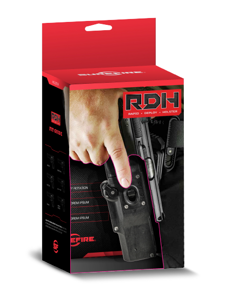
Surefire was already well known in tactical circles with their flashlights and weapon accessories. When they decided to expand into tactical holsters, they came to us for naming, logo development and packaging ideas.
TARGET THIS MARKET
FROM THE ASSIGNMENT BRIEF:
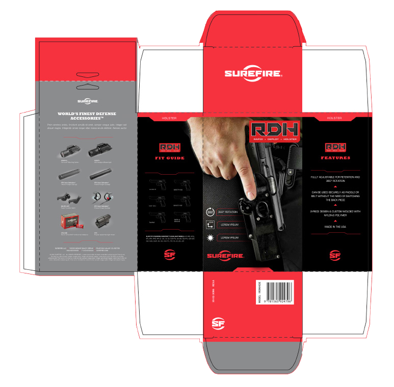
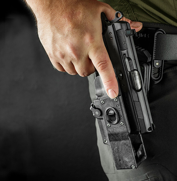
Things to keep in mind when creating these new logo designs: the logos should incorporate branding elements such as the SureFire colors – black, red, and silver, as well as the SureFire audience and consumers. Also, the packaging needed to also display the actual product and give some indication of it’s unique weapon attachment mechanism.
STANDING OUT
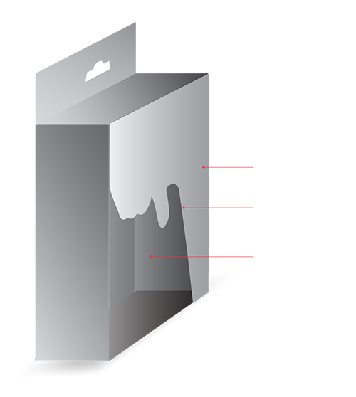
In addition to hitting the target market, this package needed to be practical to manufacture and compete on the retail shelves. The die we were working from was both hanger and shelf ready with a simplified die to accentuate the product details.
