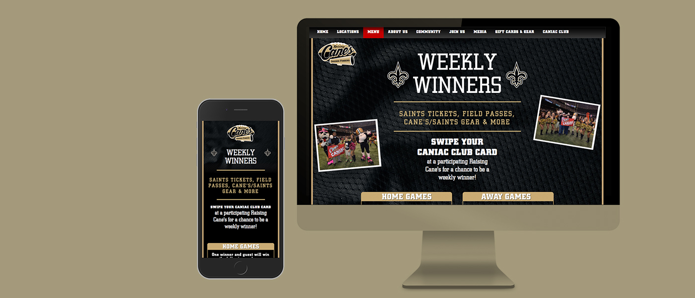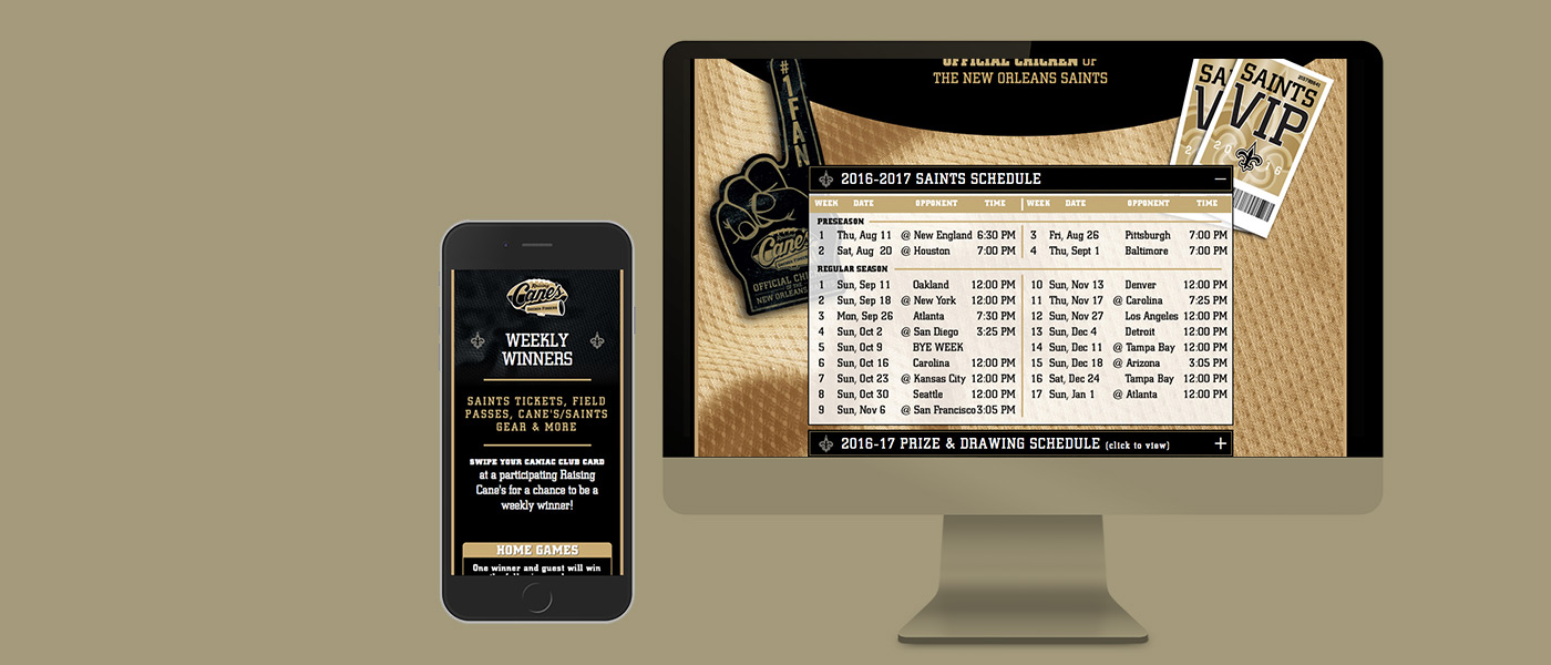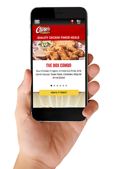
The team I work with has redesigned many sections of RaisingCanes.com to create a responsive experience along with an updated look. We’ve also taken many Raising Cane’s promotions to the web. During those projects, we worked closely with their internal marketing team to make sure we maintained the integrity of the promotion (or brand).
STRATEGY
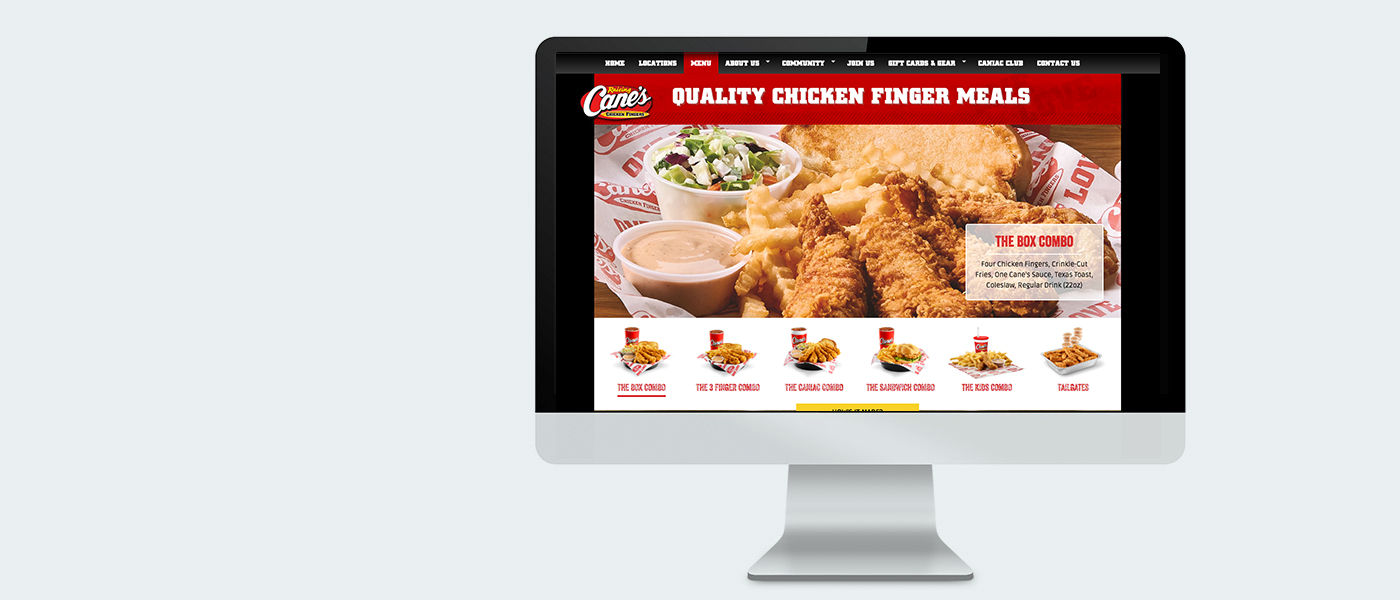
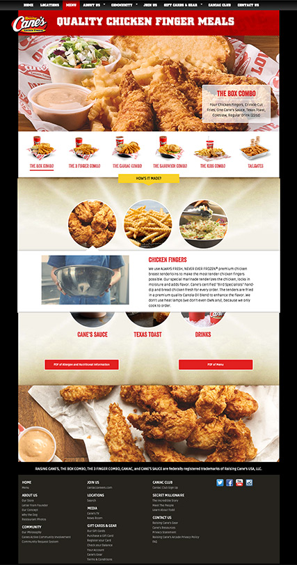
The recently completed MENU section included a slider with additional info in a selectable layer and an overlay on the ingredients that incorporates video. You can check out the live page here.
behind the scenes
GOING MOBILE
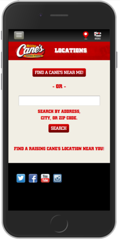
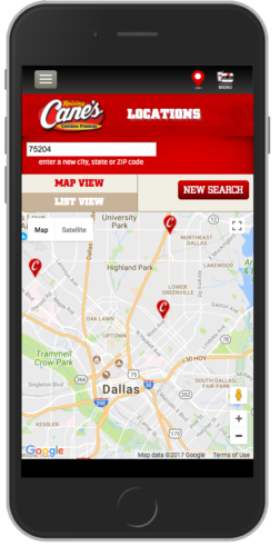
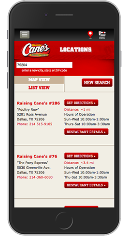
The RaisingCanes.com restaurant locator was not functional on mobile, so we created a mobile first experience for this section of the website. We kept the UI/UX experience on the phone and desktop as similar as possible.
FUTURE FUNCTIONALITY
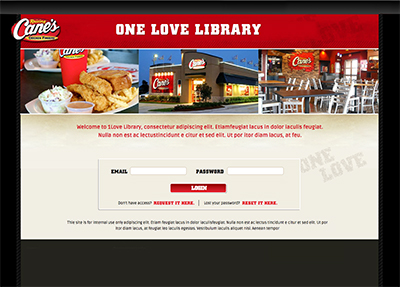
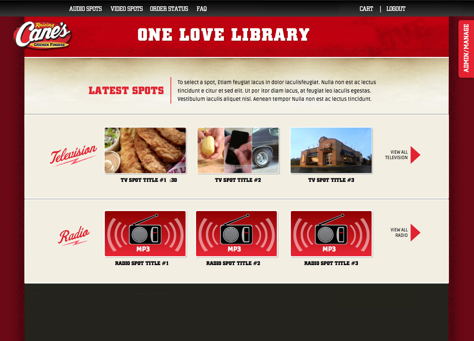
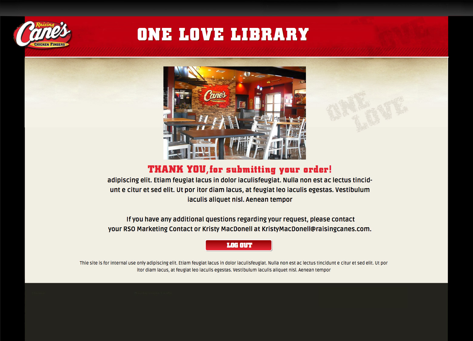
We mapped out and created this website section to assist franchisees with ordering marketing assets. Although it’s not customer facing, it was important to the team to keep the brand elements consistent, while creating an intuitive UI.


