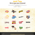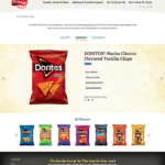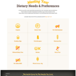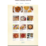
Working on Frito-Lay.com in 2013-2014 was a great opportunity. So, we were thrilled to see how we could revise and update the site in 2017! The scope of the site and amount of content we were working with required a team effort. The design of the site reflected Frito-Lays’ updated corporate branding initiatives.
NEW SITE–NEW LOOK …SAME BRAND.
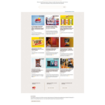
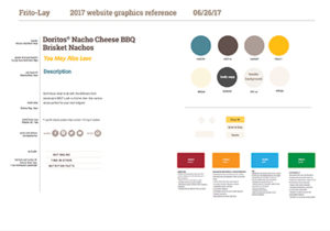
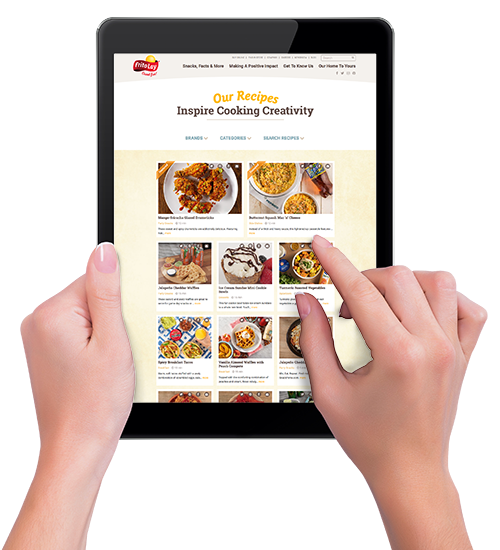
With this web update, we moved to a full-width window, an emphasis on imagery and a super-clean layout. A more subtle color palette completed light use of texture finished out the interface with a corporate, but still friendly, look. This site design also simplified the page templates, making it easier for the client web team to manage going forward.
behind the scenes
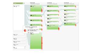
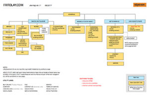
PLANNING THE UX / WEBSITE PATH
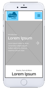
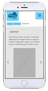
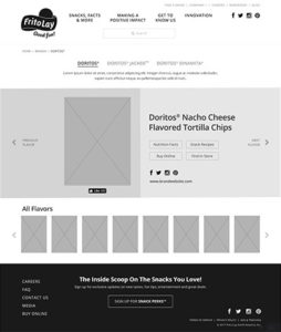
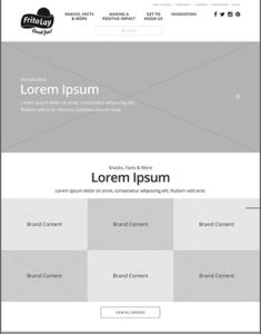
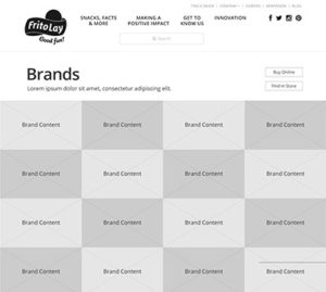
As always, before applying brand elements, we created moodboards, sitemap, and click-through wireframes of the different page templates in the site.
SOCIALLY ACCEPTABLE
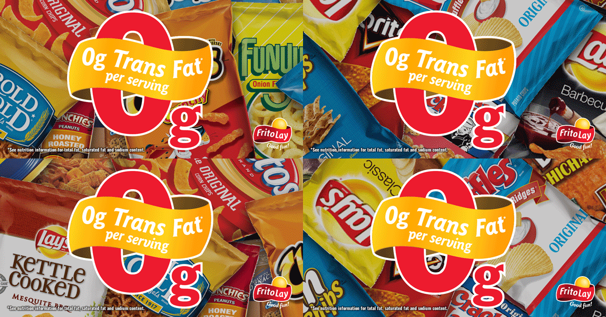
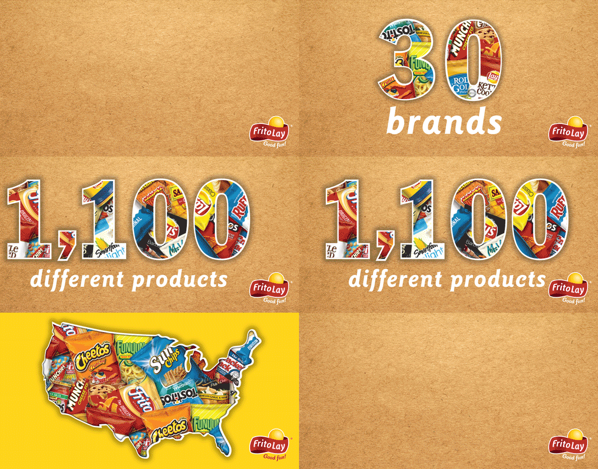
In addition to the website we ran a social media campaign the promoted the company’s goals of sustainability, diversity & inclusion and innovation.


