Our client prefers for customers to come back and apply directly on their website to reduce acquisition costs and increase retention.
17,000
WEBSITE CUSTOMERS IMPACTED PER MONTH
+30%
PERCENT OF ALL SITE TRAFFIC TO THE VIP PORTAL
plan/research
collaborate
We met with teams in different departments. We reviewed the customer journey and asked them to identify problem areas related to their areas of expertise. From this, we created a short list of recommended improvements and narrowed down to the top options that could be addressed with UX/UI.
compile data – interdepartmental meetings – brainstorming
collect data
We compiled the research from Google Analytics, Crazy Egg and Domo with the recommendations from the brainstorming meetings and created a hierarchy of importance based on number of customers affected and the potential to positively impact conversion.
Google Analytics – CrazyEgg – Domo
Diagram the journey:
This diagram shows the customer’s expected path, chronologically, through completion and back into the consumer market. Special attention was given to the communication channels and cadence throughout the process. MORE ABOUT THE CUSTOMER JOURNEY DIAGRAM ››

design/develop
define a top issue
We determined that we could reduce the number of screens for a VIP to complete the loan process by half – Going from eleven screens to just five.
We created user flows to quickly show the inefficiencies in the VIP path.
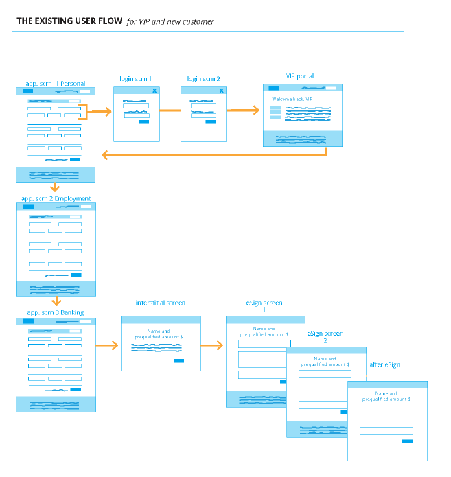
IMPROVE THE USER FLOW
The new flow diagram, showing fewer screens and areas where new elements will be added.
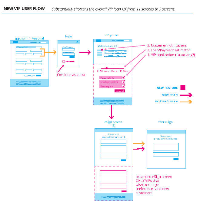
UX/UI changes
• new VIP-only application within the customer portal
• subnavigation for the VIP portal
• shortened eSign process that eliminated already answered fields
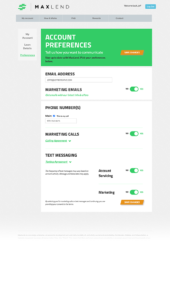
• new communication preferences screen
Working within the structure of the client website, we wireframed where elements could be moved or added. Then, we created a hi-fidelity prototype to get final sign off and start development.
user flow map – content – prototype – development
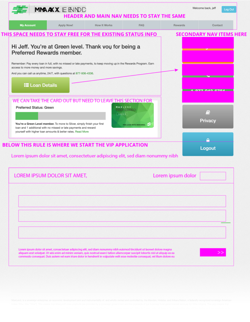
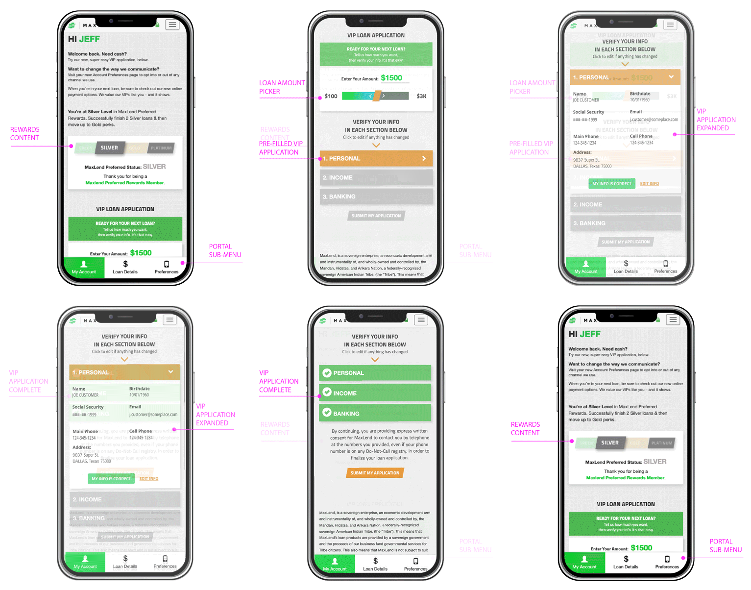
LAYOUT IMPROVEMENTS FOR THE CUSTOMER PORTAL
Existing screens were reviewed to determine how we could incorporate the updates with as little impact as possible to development time.
ORIGINAL WIREFRAME OF RECOMMENDED EDITS
IMPLEMENTED EDITS ON MOBILE
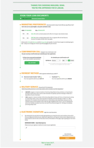
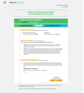
LAYOUT IMPROVEMENTS FOR eSIGN

NEW CUSTOMER ESIGN
SHORTENED VIP ESIGN
NEW PREFERENCES SCREEN
track & monitor
Google Analytics – CrazyEgg – Domo
Since the edits, we’ve increased traffic to the VIP portal with more steady traffic to eSign, Loan Details/Payments, and Preferences. 55% of site traffic now goes to the customer portal.
VOLUME TRACKING : Using Site Content in Google Analytics, we tracked the rise in user volume.
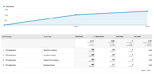
NEW EVENT TRACKING : In order to improve our tracking within the account portal, we set up new EVENT triggers in Google Tag Manager – Using the new events, we can see how many customers are completing the application vs. those who did not finish and VIPs using other areas of the portal.
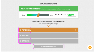
New event tracking tags were added to the application
Google Analytics was used to track the new tags over time
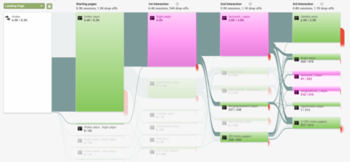
CUSTOMER BEHAVIOR TRACKING : We accomplished the goal of more traffic to the VIP portal with improved behavior flow to eSign – and customer portal. UI changes were made to all screens in the customer portal. 55% of all site traffic goes to the portal.
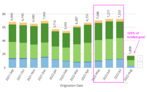
THE BOTTOM LINE – CONVERSION : This chart shows a clear rise in loan origination directly following the improvements.
